
Every business owner loves happy customers.
Happy customers spend more, they tell their friends about you, and they leave glowing reviews.
They're proof that you're doing something right.
So how do you do it better?
In this blog post, let's systematically evaluate all of the touchpoints shaping your customer's experience...
... and the actions you can take to make them better.
Let's get right to them.
As an eCommerce store, your website is your flagship. Your standard-bearer.
It's where you make your sales, and it's where you will be judged for every imperfection and typo.
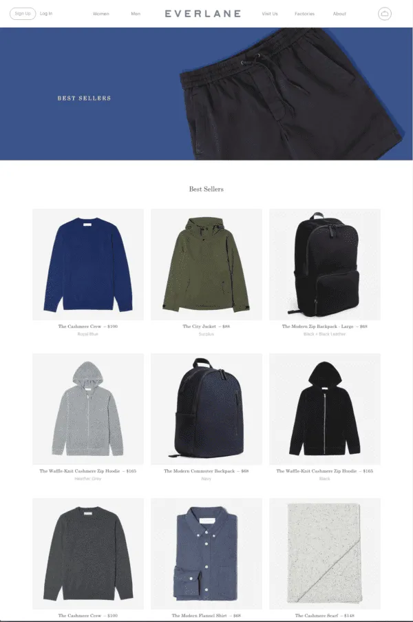
Consumers are getting more impatient than ever.
They WILL bounce from your site if it's either too slow to load, or it's taking them too long to figure out what's going on.
Too many eCommerce stores try to do too much and squeeze in so many things into their site that it becomes cumbersome.
The fastest eCommerce sites load in under 0.5 seconds.
For more advanced ways to reduce your webpage loading times, follow the steps in this comprehensive 'speed up your website' guide by 99signals.
Things to measure:
It's great to have a fast, easy-to-navigate site, but all of that is worthless if nobody cares about what's on it.
You want anybody who lands on your website to be able to quickly and easily tell what your product can do for them.
Slim wallet makers Bellroy are very good at this:
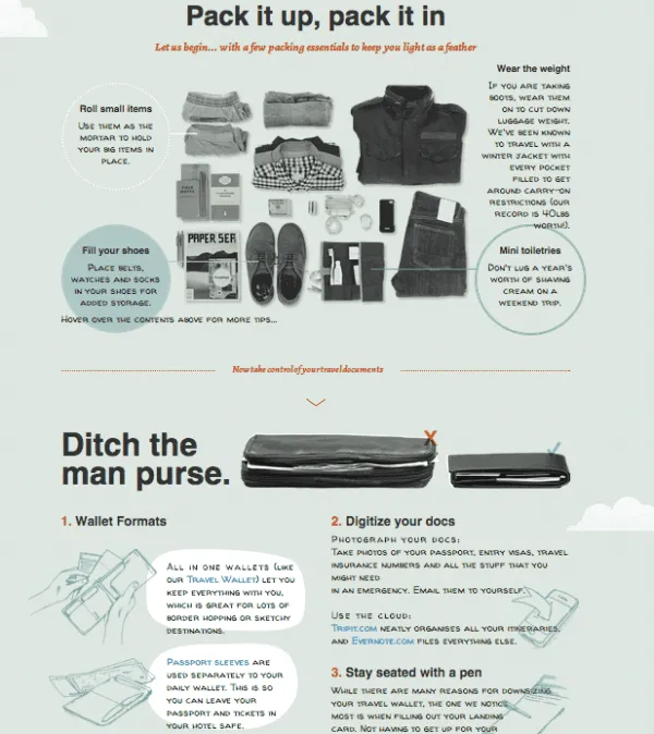
To get good at this, you need to be able to answer several questions:
Every product page has just one job – it needs to convince the visitor that the product is worth buying.
It should have...
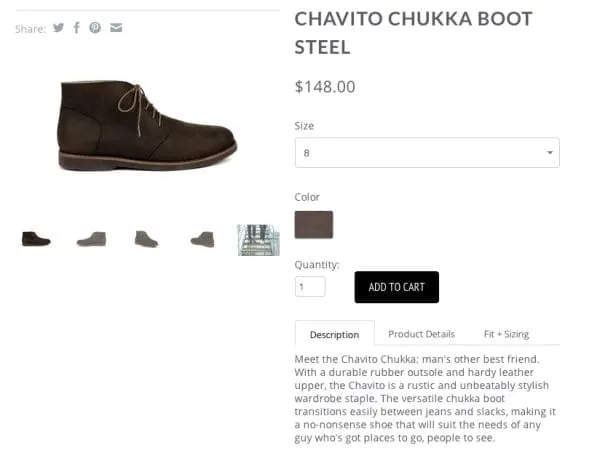
Lindsay Kolowich from Hubspot put together a nice list of 14 great product page designs that you can get inspiration from.
Her takeaways were...
Things to pay attention to:
Read next: 24 of the best eCommerce web designs to inspire you

This is an entire field of eCommerce specialization called Checkout Optimization, and every eCommerce store should always be working on this regardless of what you're selling.
ConversionXL is particularly good with this – see Peep Laja's post on How to design an eCommerce checkout flow that converts.
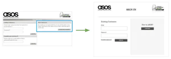
This visual of ASOS improving the signup portion of their checkout process is particularly arresting:
Also read: Neil Patel's 40 checkout page strategies to improve conversion rates
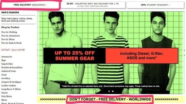
Do you offer free shipping? You should! As Anna Kegler from RJMetrics puts it, "Free shipping influences consumer behavior on a deeply psychological (and often irrational) level, adding a powerful boost to your average order value."
It's been proven over and over again that customers would rather spend more on the product and have free shipping than save on the product and spend more on shipping.
For inspiration, David Moth wrote a great article for Econsultancy with lots of examples on how to talk about your free delivery service.
Make sure your "add to cart" system is super clear
Have a pop-up window saying “item has been added to cart; do you want to visit your cart, or continue shopping?”, like Cole Haan:

Cole Haan’s shopping cart. The pop-up (highlighted in red) is easily noticeable.
Alternatively, direct users to the shopping cart page once they add an item to it, like in the case of Warby Parker or Sunpocket.
The North Face does a great job of this. Rather than focusing entirely on their products, they use their blog as an opportunity to celebrate their customers.
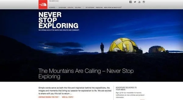
Your customers are buying your products because they want it to help them do something. You want to talk about that. You want to help to clarify the desire that they already have.
When they associate that with you and your brand, they're that much likelier to decide to buy your products.
Story by ModCloth is another great example to study. The blog is a great companion and destination for potential shoppers, and like TNF's blog, there's zero sales content.
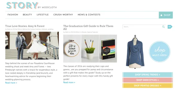
Blog posts cover everything from interview features with trendy individuals, occasion-specific style advice, gift guides, travel tips and advice, and even delicious recipes.
What to measure:
Read next: 24 tips for eCommerce content marketing from inbound pros and 7 ways to achieve content marketing breakthroughs
A study from IAB found that 90% of consumers would recommend a brand to others after interacting with them on social media.
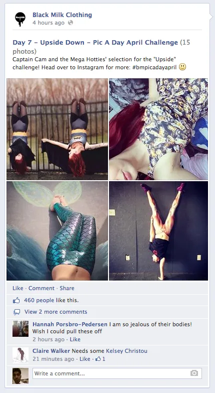
Black Milk Clothing is a great example to follow here. They have lots of Facebook groups around the world, including a massive "Sell, Swap, Buy" group with over 15,000 members.
They also feature customers' Instagram photos on their actual product pages, which gives social currency to their happy customers AND makes it easier for new customers to see what the products look like on real people.
Read next: Examples of community-focused marketing
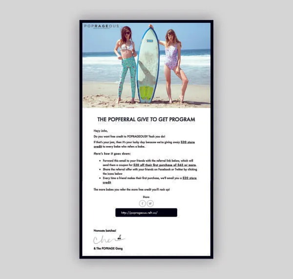
There are several parts to the email system of any eCommerce store.
In all cases, as with the rest of your content, you want to be clear...
Read next: How to write great emails asking for referrals
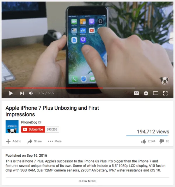
Apple is probably the gold standard here, but there are lots of ordinary retailers who do this well too.
Beardbrand is one such example of a brand that manages to create a fun unboxing experience for its customers.
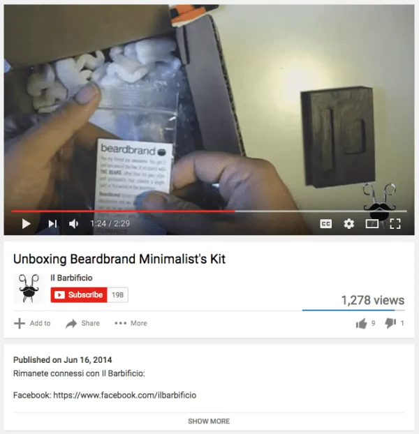
Richard Lazzazera wrote a great blogpost about this on Shopify's blog: How to create a memorable and shareable unboxing experience for your brand.
What if you're selling something that doesn't fit into a fun little box?
You can still encourage your customers to share the product on social media:

Your relationship with your customers doesn't end after they hand you their cash and you deliver them your product.
Happy customers are incredibly valuable – they're the source of your most important word-of-mouth.
Tommy Walker wrote a great post about this for Shopify: What happens after checkout?
You'll want to find out what your Net Promoter Score is:
One of the things you want to do early and often is to collect information from your customers.
Kevin Donnelly wrote a post about this for the Shopify blog, about writing a single email to get insights from your customer.
Seth Godin has often written about how important and powerful it is to do great customer service, and how so many businesses get it wrong by trying to cut costs here.
A customer with a broken or spoilt product or some other unhappy scenario is going to be more emotional than a customer that's happy or shopping around. They could leave you a terrible review or a fantastic one, depending on how you handle them. They could come away hating your brand and telling everyone to boycott you, or they could turn into a raving fan that helps you get many, many more sales.
One of my favorite stories here is of an Amazon customer service rep's hilarious role-playing exchange with a customer, which went viral on Reddit:

Read next: 17 examples of companies delighting their customers
That said, providing good customer service is no easy feat. It takes knowing your product/audience well, setting up the right customer support systems, hiring the right people, and even training them to provide good service. But there's definitely a ton of ROI in improving your customer service. In fact, it's so important that a recent study by Nextiva found that a third of consumers say they would consider switching companies after just one instance of bad customer service.
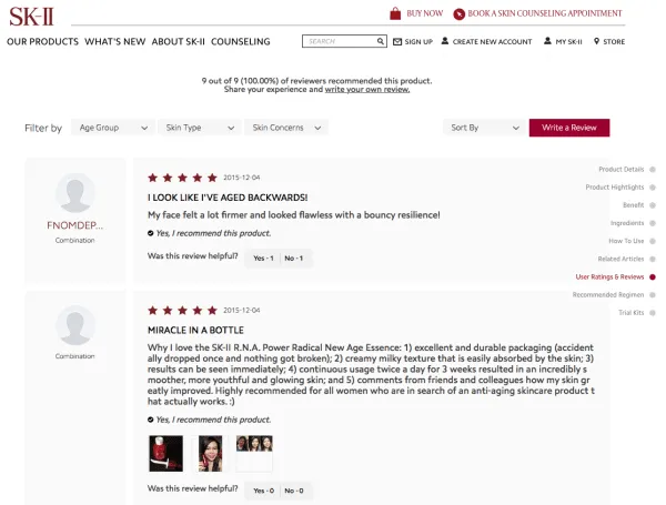
Reviews are already a huge part of how the eCommerce world works. It's obvious that this is a trend that isn't going to go backwards – consumers are going to keep wanting more and more information about products, not less. And as consumers, we trust information from one another way more than we trust information in advertising.
It's even plausible that an effective review-getting strategy might help to establish a competitive advantage. There's a virtuous cycle there – delight your customers, get good reviews, get more new customers, get more good reviews, and so on.
Read next: How to amplify word-of-mouth by leveraging customer reviews
The Growth team at Airbnb pointed out something unique about referral programs - they're one of the only ways for a business to reach directly to the friends of their customers.
But you only get to do that if you've already sufficiently delighted your customers, so make sure that you've already gotten some good reviews and social media feedback.
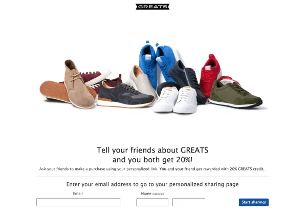
Read next: An epic list of 47 referral program examples
1. Repeat/referral sales volume. This will vary from industry to industry – people seldom buy multiple mattresses, for example. But recurring sales, in general, are a good sign. Repeat customers are also probably more open to giving you feedback.
2. Quantity and quality of reviews. What's the frequency of reviews that you're getting? You might want to use a tool like Yotpo.
3. Sentiments on social media. You want to constantly be doing searches on Twitter, Facebook, Reddit and so on to see what people are saying about your business. Consider setting up a Google Alert for mentions of your brand, or even use paid tools like Mention or Ahrefs.
4. Replies to support emails. Unhappy or frustrated customers can give you some of the most valuable information you'll ever get to make your business better.
5. Net Promoter Scores. Want to know if your customers would refer your store? Why not ask them outright?
6. Customer referrals. If you're getting at least a hundred transactions a month, and you've gotten some positive mentions on social media, it's worth setting up a referral program to see if you can get customer referrals. There's no better proof that people love what you do.
7. Talk to your customers! This takes the most work but can be the most illuminating. Andy Dunn from Bonobos reached out to thousands of their customers to ask them what their favorite things about the brand were, then incorporated their feedback into the branding of the store. If you have customers that you haven't spoken to in a while, reach out for a chat.
What have your experiences been in trying to improve your business's customer experience? Or better yet, what has blown YOU away, as a customer?
Raúl Galera is the Growth Lead at ReferralCandy, where they’ve helped 30,000+ eCommerce brands drive sales through referrals and word-of-mouth marketing. Over the past 8+ years, Raúl has worked hands-on with DTC merchants of all sizes (from scrappy Shopify startups to household names) helping them turn happy customers into revenue-driving advocates. Raúl’s been featured on dozens of top eCommerce podcasts, contributed to leading industry publications, and regularly speaks about customer acquisition, retention, and brand growth at industry events.
Grow your sales at a ridiculously
lower CAC.