One of the most popular posts we've ever written is "An Epic List Of 47 Referral Programs". It's been quoted and linked hundreds of times. But that post doesn't give the full picture of what referral programs really look like.
Referral programs have multiple parts. In the epic list earlier, we showed you mostly the calls to action or the referral signup page.
The Friend Landing Page is the page that your Advocates' friends are taken to once they click on a referral link.
It's important to get this page right – you want it to entice the friends of your Advocates to click through and then shop at your store.
In particular, you want to...
(Note: All discount coupons have been modified.)
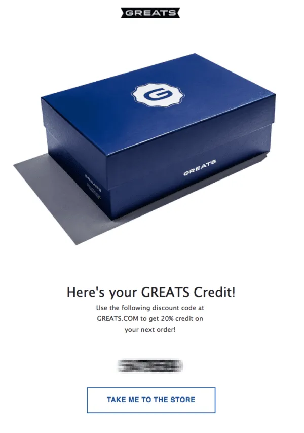
I love the use of the shoebox image – it instantly reminds me of the nice feeling of having already bought a brand new pair of shoes and having them ready to go.
> Learn more about GREATS and their referral program.
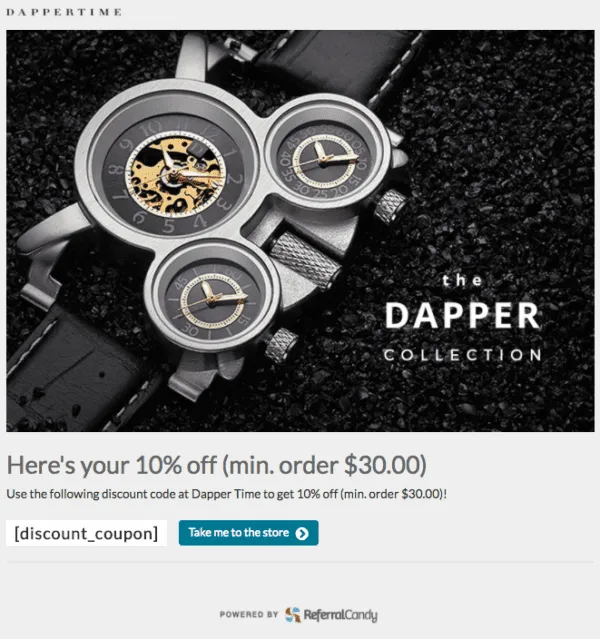
> Learn more about DapperTime and their referral program.
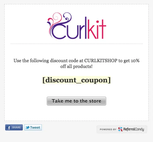
Simple and effective.
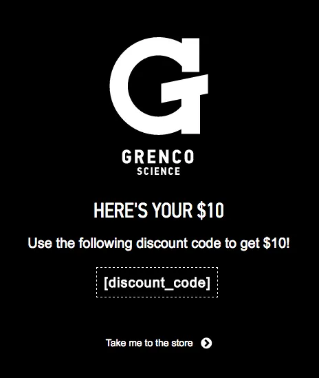
Bold white on black.
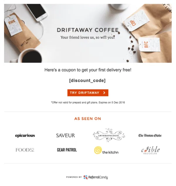
Nice use of social proof ("your friend loves us, so will you") and 'As Seen On' to convey authority.
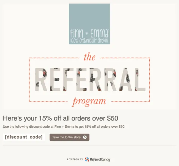
I love the amount of effort that Finn+Emma put into coming up with a custom image for their referral program. Their attention to detail really shows.
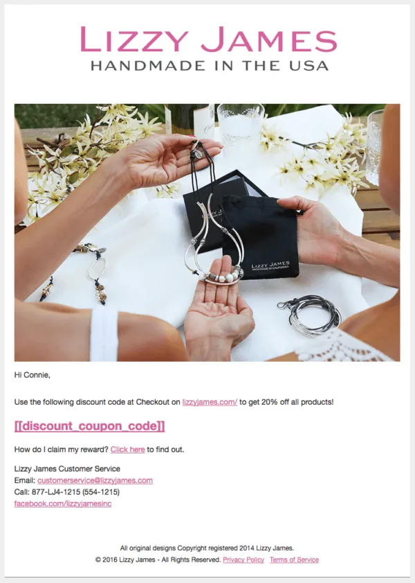
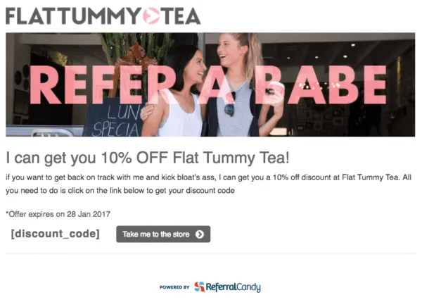
Strong use of a 'hero image' with a very strong call to action, and it's very consistent with the rest of their branding.
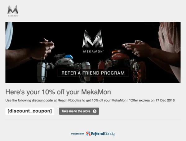
Mekamon sells next-generation gaming robots with AR functionality, and their hero image totally conveys that futuristic sci-fi vibe that its fans are into.

Powerful background image, clear call-to-action.

Bourbon & Boots really emphasizes the benefit to the friend of the advocate, and they have a stylish on-brand header image.
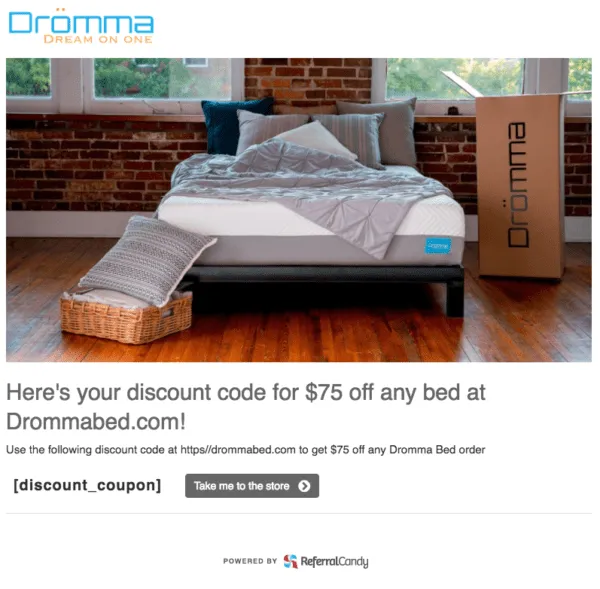

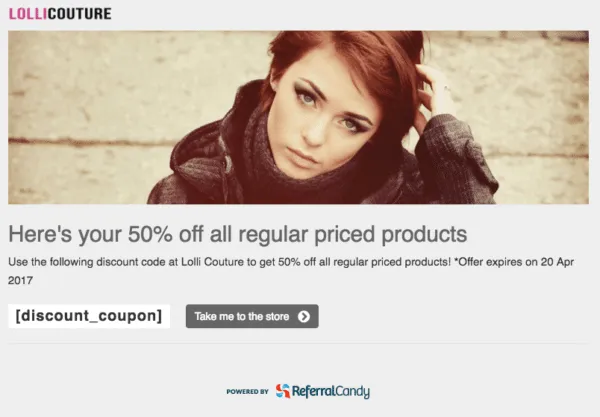
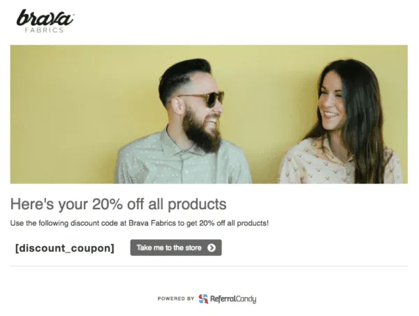

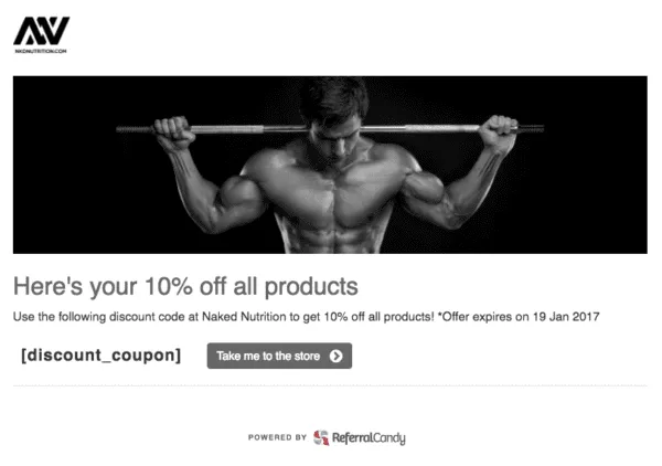

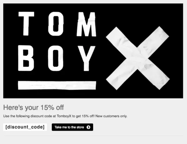
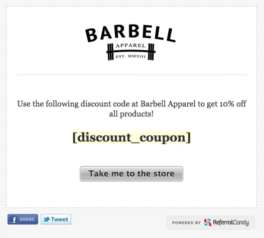
Bold, black-and-white, minimalist. Pretty powerful.
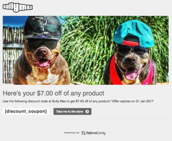
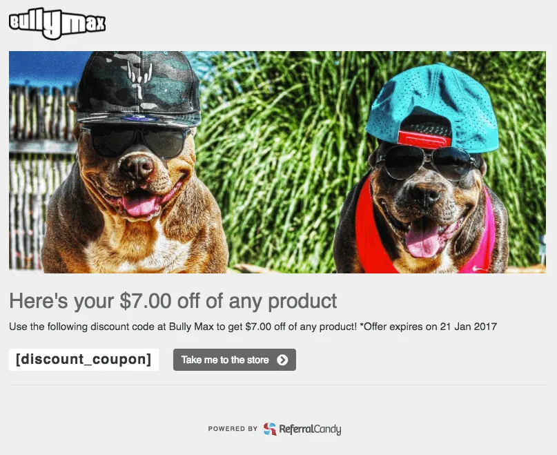
A fun picture of two dogs, and a straightforward offer of $7 off any product.
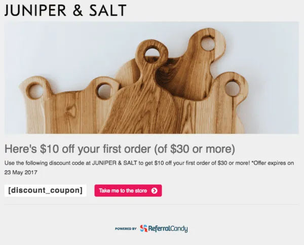
Really nice use of the 'hero image' to communicate the quality of the product – wooden kitchen supplies.

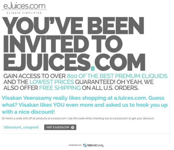
Very bold, with lots of copy.
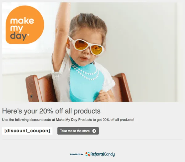
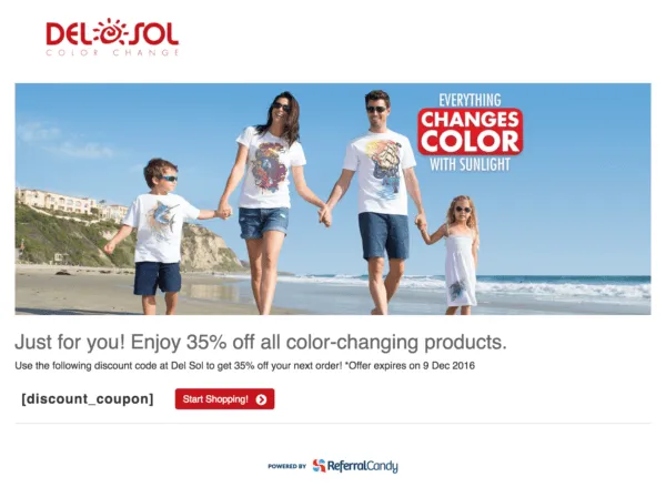
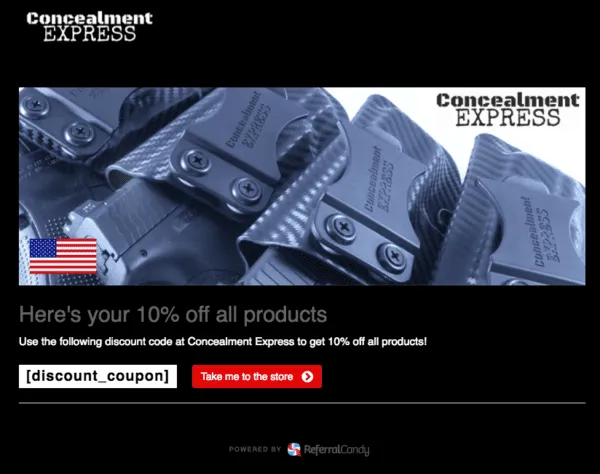
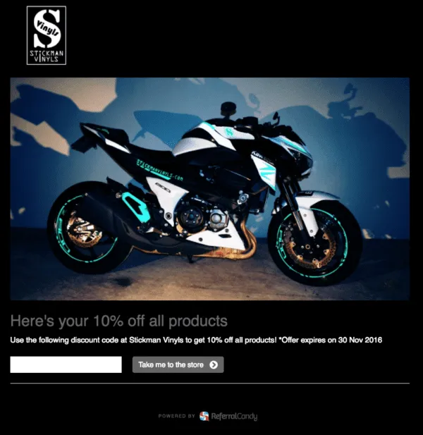

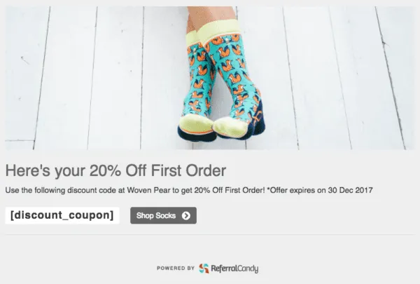
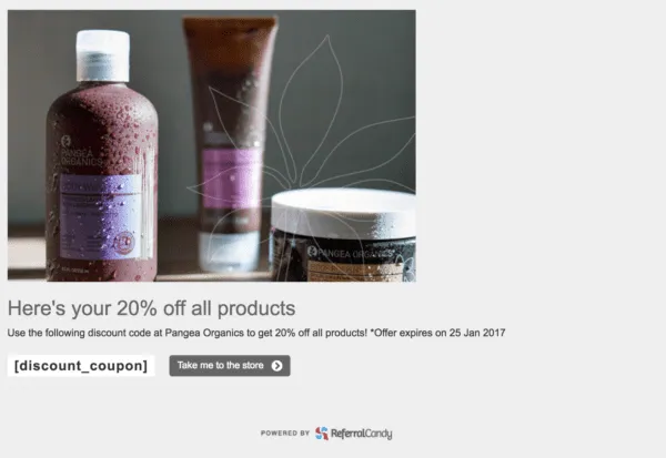
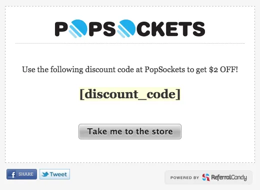
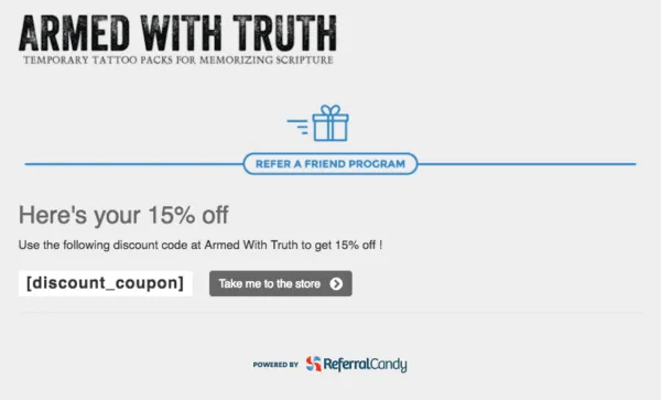
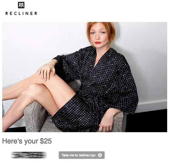
Keeping things simple!
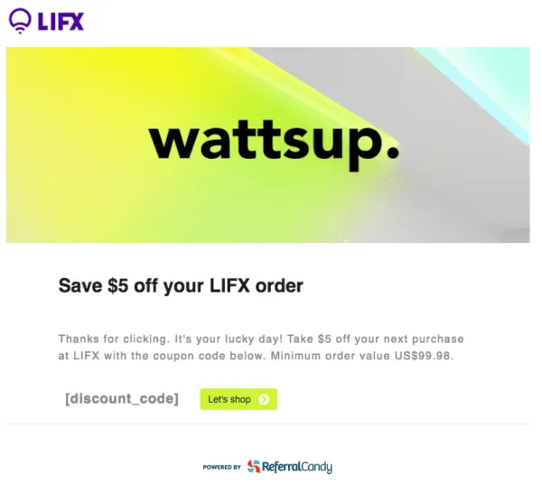
Lighthearted and memorable.
Raúl Galera is the Growth Lead at ReferralCandy, where they’ve helped 30,000+ eCommerce brands drive sales through referrals and word-of-mouth marketing. Over the past 8+ years, Raúl has worked hands-on with DTC merchants of all sizes (from scrappy Shopify startups to household names) helping them turn happy customers into revenue-driving advocates. Raúl’s been featured on dozens of top eCommerce podcasts, contributed to leading industry publications, and regularly speaks about customer acquisition, retention, and brand growth at industry events.
Grow your sales at a ridiculously
lower CAC.