
Robert Cialdini, Professor Emeritus of psychology and marketing at Arizona State University, as well as advisor to the Obama re-election campaign in 2012, calls this a 'privileged moment for change'. In this privileged moment for change, visitors to a home furnishing website were shown clouds on the page background at the very beginning. Later, they were found to rate comfort as more important than price. Conversely, users shown coins were found to value price more than comfort.
You may wonder how this has anything to do with social referrals. In truth, it has everything to do with referrals. The clouds and coins are the scales on which visitors will weigh the merits of your product.
Can we also find and create a privileged moment for change such that when we ask visitors to refer a friend, they will not only make the referral, they will do so even without explicit mention of a reward?
The two things that we marketers relentlessly look for in our reading are "actionable advice" and "real-life examples".
With these in mind let us look at a few examples of ReferralCandy's referral tools at work and how we could apply the idea of creating privileged moments for change to make our ask to share as effective as possible.
(NOTE: Looking for a referral program? Try ReferralCandy free here.)
small, click-to-open popup
Referral widgets make sharing easy.
Their biggest benefit is that a site visitor can convert at any time. It isn't necessary for visitors to scroll down to the call-to-action if it is always within view.
For example, this feature of the widget blends well with Real Food Ready. Eating and talking is a cornerstone of civilization. When I imagine mealtimes, I visualize the moment with family and friends. When your mind goes to someone to share with, the widget is within reach. Without special preparation, the privileged moment for change has been set.
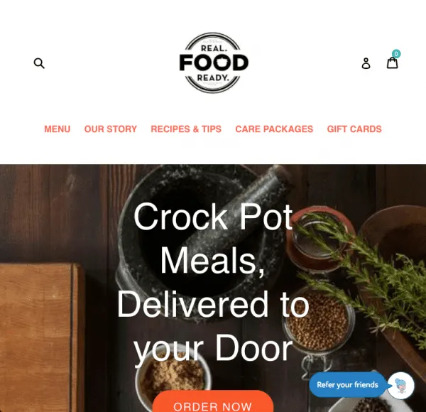
With reference to RealFoodReady, a change that may squeeze more referrals out of the widget would be to use a call-to-action with a more specific request, as well as a greater cognitive ease. This could be "Refer a friend". By being narrowly specific, we increase the chances that our request will be accepted.
People can sign up to your referral program from any page where the form is embedded
The embedded sharing page is the only product that is intended for the purpose of recruiting advocates. Referral recipients will not be exposed to it in the usual course of business.
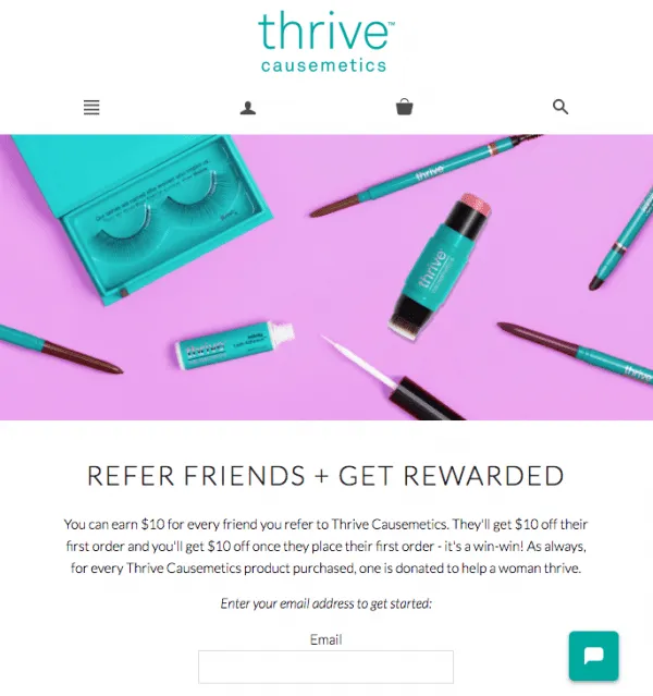
Thrive uses a photo of their products on this page for the banner. We could do one better by reminding the visitor that by referring a friend, they are improving the life of yet another woman.
The image used could be as simple as two women side-by-side holding the same Thrive product between them. The feelings of togetherness and sharing evoked are perfectly in sync with the purpose of the page.
I'd like to digress momentarily to referral program sign ups in general:
The 2 motivations for viewing this page are some combination of liking for the product and/or company, as well as financial rewards. Veteran marketers remember all too well what affiliate marketing sign up pages are like.
Emphasis is placed on the attractive rates offered and the payout times (monthly? quarterly?), as well as the enormous amount of money that has already been paid to affiliates.
It is easy to default to this best practice, but it would be wrong. The average affiliate marketer views higher rates and regular payouts as a greater priority than the referral marketer. To a referral marketer, signing up for a referral program is an endorsement of a product or company. This is not purely a financial consideration.
In order to obtain the highest signup rate for visitors to the sharing page, we want to accurately reflect our visitors' state of mind. This technique is called pacing and leading.
Paraphrasing and reflecting your persuasion partner's emotional state builds rapport and trust. Thereafter they may allow you to lead them towards signing up.
In our example, Thrive would like to invite you to join their referral program. The header succinctly states "Refer Friends + Get Rewarded". It is possible that the main reward sought by their fans is not monetary. Every purchase at Thrive results in a donation to "help a woman thrive".
A header like "Get Your Own Referral Code To Support Thrive" paces the visitor by restating an important motivation for advocates of Thrive. At this point, visitors are likely to sign up. We can now take it a step further by leading them towards a desirable outcome by suggesting that they share the code on Facebook or their blog. Crafting referral copy that truly resonates often requires multiple iterations and a deep understanding of audience psychology. When teams are testing different messages or refining longer explanations for referral pages, having access to structured writing support can be helpful. Tools and services like paper writer platforms are sometimes used as a reference for organizing ideas, improving clarity, and polishing persuasive language, especially when marketing teams need to move quickly without sacrificing quality.
Recommended Reading: 8 Easy Rules to Write Product Descriptions That Sell (With Examples)
Invite friends post purchase to tell their friends about you
When I buy something, like most people, I get a small rush of euphoria. With books about entrepreneurship, I have a couple of friends that I almost automatically find myself telling about the exciting new book that I'm expecting soon.
This is the privileged moment in which ReferralCandy offers the most direct help to marketers.
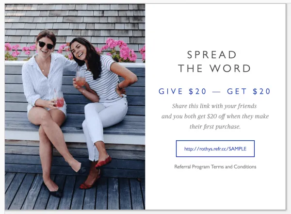
Unfortunately, there is a typical message seen everywhere, including our Rothy’s example above. It goes something like this: share your personalized promo code with friends to earn more rewards.
As motivations go, a small financial reward in isolation is not all that powerful. We can augment its effectiveness with some kinds of social validation.
Take these examples. Thank the user for:
This goes beyond a simple thank you for a purchase. Your store embodies a quality to your customers, and you can build a rapport with them by acknowledging this.
Thereafter, with the thoughts of sharing and caring now established in the mind of the visitor, invite the user to share a particular product of yours with a friend who would appreciate it.
Links to the referral page are often positioned on the homepage. However, beyond that, there is a universe of variety in where and how the link is presented. In order to maximize the outcome of your referral page, let's consider a few examples.

Amuze places the CTA at the very top of their homepage.
This runs counter to every piece of marketing advice suggesting that we have to earn our visitors' trust before asking for an action. You may already have guessed that we are going against the grain again with our example here. The reason that I agree with this placement is that Amuze' customers are highly price sensitive. We can expect them to be receptive to opportunities to save.
So converting them early is the smart decision. In addition, the commitment and consistency principle reinforces the user's own positive perception of Amuze with their decision to refer a friend. This is favourable for future purchases by the user.
The next example is Untuckit.
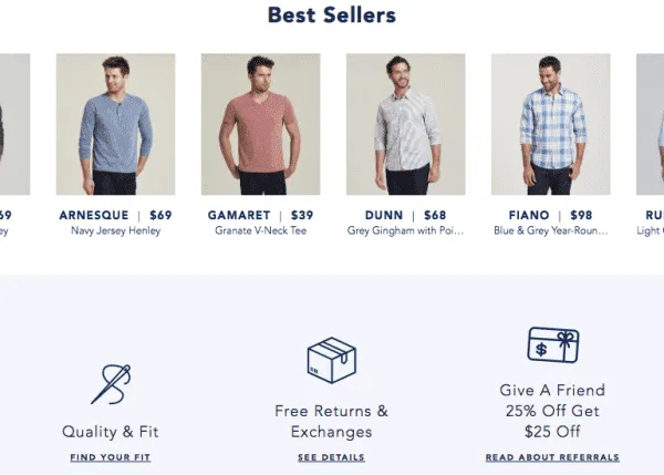
The value proposition for Untuckit is quality and style. This perception takes time to cultivate. As a result, it is entirely natural that the CTA sits much further down the homepage compared to Amuze.
The referral CTA sits beneath the bestsellers section. The CTA says "Give a friend 25% off, Get $25 off".
I am speculating that Untuckit customers are less price sensitive than Amuze customers, and when they refer a friend, it is because they share the same sense of style and preference for quality.
With that assumption, we could try a CTA that places greater emphasis on this - "Tell A Stylish Friend & Give Them 25% Off". The reward to the user could be revealed in the following page.
There is strong evidence that small monetary rewards can backfire, and evidence as well that the timing of rewards increases reciprocal behaviour. By waiting until the user arrives at the referral page to reveal the reward for referring a friend, Untuckit can offer the $25 reward as a thank you to the user for their referral. The timing and sequence of these CTAs and revealed rewards could yield a superior conversion rate.

A similar lesson applies to Banish Acne Scars. Customers are drawn to it for its efficacy in solving a highly personal problem. The CTA in the footer says "Get $10 off". This is potentially a big mismatch between the motivation of the referrer, and the value proposition of the CTA. We could try a CTA such as "Help a friend banish their scars".

The last example for us is Rothy’s.
The Rothy’s referral CTA is cleverly placed next to the gift card CTA. Inevitably, we picture ourselves gifting Rothy's to someone in our lives.
In my view, we can reinforce this privileged moment for gifting by removing or downplaying the reward earned by referrers. The main CTA could read "Give $20 Off". The subtitle "Refer A Friend" tells visitors that this is a referral, with the associated implied rewards. For our part, we just have to keep the spotlight on gifting.
With 2 CTAs, we can also benefit from the classic "door in the face" persuasion technique, a favourite with sales professionals. In Rothy's case, the visitor who declines in their mind to purchase a gift card, may feel more inclined to refer a friend instead.
A note of caution though. In experiments involving the "door in the face" technique, interactions between persuader and subject took place face to face.
This is not the case online. We could nonetheless attempt to trigger this response with photos of people who appear to be employees of Rothy's. If you decide to give this a try, let me know if it works.
You’ve probably been thinking while you read this how you can apply some of these lessons to your own pages and campaigns. As you find yourself grappling with whether to rewrite all your referral copy or just modify it piecemeal, take a moment to just catch your breath and leave a question below.
After all, we wouldn’t want this privileged moment to go to waste.
Wei Leen is the chief consultant at Lean Metrics, where cognitive science and data-driven marketing meet. SEO, SEM, Facebook ads, landing pages and inbound marketing are the areas that Lean Metrics thrives in.
Grow your sales at a ridiculously
lower CAC.