
If you're wondering how to improve your email open rates or trying to reach your eCommerce customers, you need to pay big attention to your welcome emails. The average open rate for a welcome email is a whopping 50%.
Yes, you read that right. This makes welcome emails 86% more effective than standard newsletters - and we already know effective email marketing can be.
Welcome emails are pretty darn important given their effectiveness and high open rates. But, what exactly are welcome emails
A welcome email is the first impression a company makes with a new subscriber or customer. It's the first email you receive when you give your email address to a company. It is your inroad, your chance of building a fruitful lasting relationship with your audience.
Welcome emails can generally be categorized into 4 categories, based on the dimensions of tone (casual vs salesy) or position in the marketing funnel (awareness vs conversion).
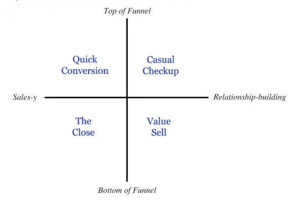
Customer.io analysed 50 welcome email examples to create this classification
Quick Conversion emails attempt to get you to take a quick action and they are more conversion oriented rather than conversational in nature.
Casual Checkups are usually short, text only emails and are used to collect information or gauge interest of the recipient. These emails are more user focused rather than product focused.
The Close emails are used to nudge prospects and turn them into customers. Their purpose is to get prospects to buy something quickly.
Value Sell welcome emails are used to retain and nurture existing customers. Their purpose is to showcase other products and benefits a user can expect from your business.
After appreciating these facts and the types of welcome emails that are used, it is evident how advantageous they can be. They can help you build more awareness, close a sale or even upsell on your items.
So we want to inspire you with some of the best examples of welcome emails from companies around the internet and show you what they did, and teardown some of their choices into key takeaways and lessons you can use in your own welcome emails.
eCommerce Welcome Emails Teardown - Menus
Modsy is a design-solution website that lets you visualize your home projects. After you sign up with them, you receive a casual email from their management team.
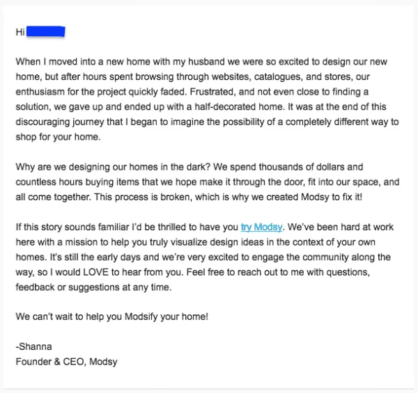
A personal check in from the first person to Modsify their home
This welcome email falls under the category of Casual Checkups. Such emails are top of funnel, relationship building emails. Rather than trying to push a product on you or closing a sale, these emails are about building awareness and learning from customers.
Such emails are popular with startups and small operations because their plain text, no image format embellishes them with a touch of personalization, where the recipient feels as if the CEO herself is in conversation with them.
What I really like about the email is how, right off the bat, it starts with a personal story that is relatable for anyone who’s in the target audience for Modsy. They built a precedent for trust by showcasing how they understand the reader’s pain points in the first paragraph.
After establishing interest by narrating a relatable story, the email lets the readers know that Modsy is still a small company and they humbly ask the reader to give their feedback. No “I will change your life” sort of promises and no over the top mentioned of company accolades.
This is just a simple welcome email that tells it how it is, and the straightforward honest nature of this welcome email is what makes it brilliant.
Key Takeaways: If you are a small operation, or if people sign up for your newsletter with little intent of buying anything yet, sending them a casual checkup is an excellent way to get noticed. Readers feel like your brand doesn't want to hunt them down for their money right away, and casual checkups give you a good opportunity to introduce yourself and your brand.
Allbirds, a Kiwi shoe brand, pride themselves in having ‘The World’s Most Comfortable Shoes’. Their aesthetic revolves around simplicity, comfort, and minimalism. Their marketing is geared towards 20-somethings who care about both design and nature.
Keeping these attributes in mind, when you sign up with Allbirds’ email list, they deliver a refreshing welcome email true to their brand image.
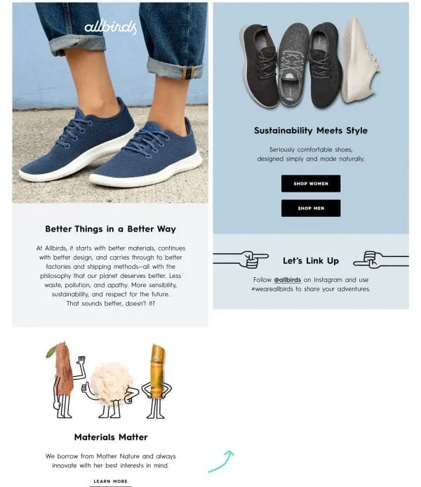
We split their (rather long) email into two so you can see the consistent palette
Right off the bat, the first thing to notice about this email is choice of colors, and imagery used. The colors complement the shoes and brown/blue hues represent the friendliness and coolness of the brand. The images, photos of actual shoes mixed with light illustrations show that Allbird is serious when it comes to its products but is just as friendly with their customers.
Allbird knows that the welcome email is a golden chance to build a base for a lasting relationship with a customer or subscriber. Keeping that in mind, they’ve chosen apt subheadings interspaced with only the most essential CTAs (call-to-action buttons).
The headings ‘Better Things in a Better Way’, ‘Materials Matter’ and ‘Sustainability Meets Style’, all point towards the brand’s central message. They are saying sustainability is cool and doing a very good job of delivering the message.
Finally, they ask subscribers to ‘link-up’ on social media, employing vernacular most relatable to environment-conscious millennials. This not only gives the message that Allbirds is one of them but also advances their social media marketing goals.
Takeaways: Allbirds have shown that even a long, graphic heavy welcome email can be effective. What is most important when designing a welcome email is knowing who you are writing to. In this example, we see that Allbirds has a good understanding of their target market and so they are able to craft an exciting, relevant email.
Asana is a web-based project management tool used by professionals working in the digital space. Their welcome email is a no-frills, straight to the point sort email. This is an example of what is called the ‘Quick Conversion’ welcome email. It is designed to get you to accomplish one quick thing, whether that’s taking an action within a product, inviting or referring a friend, or opening up your contacts.
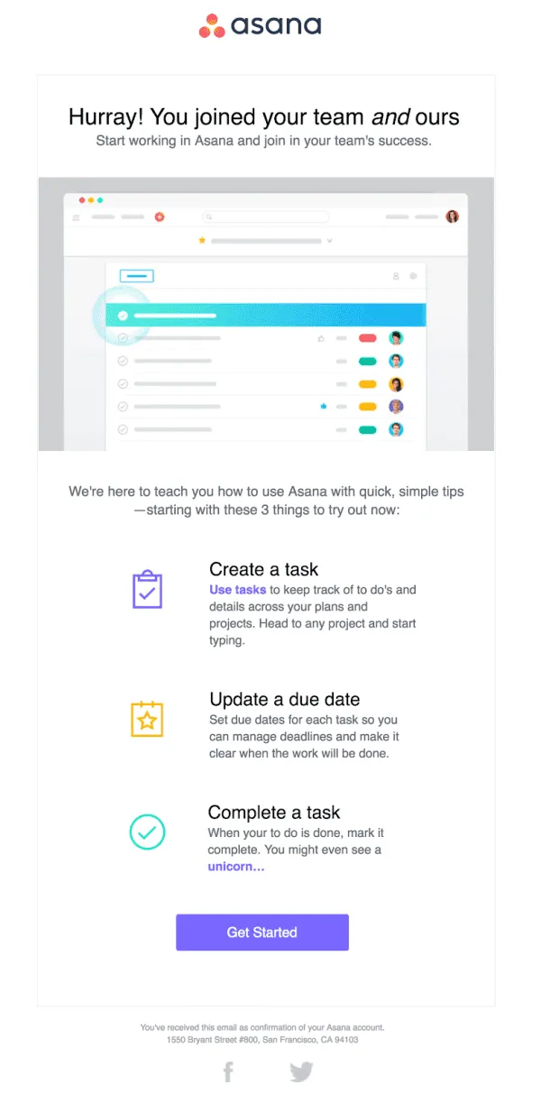
Even Asana's welcome email looks like a task-management checklist
What I like about this email is the brilliant use of whitespace contrasted against strong colors. Because the colors are used in very small areas, they never become distracting and do a good job of complementing the main message.
The email itself is very straightforward, once you’ve signed up, you get this email that offers 3 quick tips which are the backbone of being able to use asana efficiently.
Takeaways: If you’re selling a software solution or a product that requires a learning curve, it's a smart idea to send a quick conversion, support style email as soon as the purchase is verified. You want your customers to have a fluid and hassle-free experience with your products and such emails go a long way in ensuring happy customers.
Michaels is an online retail shop that specializes in arts and crafts, and home decor items. This is the welcome email they send (it's a bit long - but keep scrolling!):
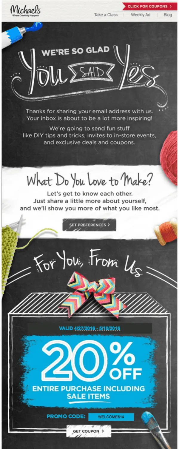
Artsy.
Similar to Allbirds, Michaels also does a great job of personifying their brand within their welcome email. This is a great practice because as we mentioned earlier, welcome emails have the highest open rates and tend to land the biggest impression.
The email itself is presented like an arts and crafts project, plus the bright colors and messy fonts represent the biggest element in DIY projects: fun and messiness.
The title of the email is catchy and shows the brand’s gratitude towards a recipient signing up with their mailing list. The copy underneath the title immediately clarifies the value exchange a subscriber can expect from Michaels. And just to make things even better, they follow their value proposition by actually offering a 20% sitewide discount.
Most consumers don’t take brand promises very seriously, but if done in Michaels’ style i.e. by promising and delivering within the same email, you can expect them to stick around and become loyal customers.
Takeaways: Consumers love it when you deliver on a promise. Make sure your welcome emails offer only as much as you can provide. With that said, make sure to explicitly mention all the benefits subscribers can derive from using your product or reading your newsletters.
Editor: Another way to add value is to integrate your referral program with email marketing campaigns, like with ReferralCandy for Mailchimp.
BirchBox specializes in grooming products and promises the best products without the hassle of searching for them. When you become a subscriber, this is the email you receive:
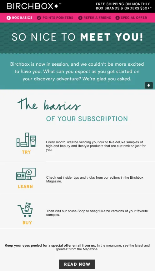
This one caught my attention because they’ve used a mix of Casual Checkup with Quick Conversion style to really drive the email home.
You’ll notice that they make sure to greet their subscriber with a ‘so nice to meet you’ before getting on to business. After an introduction email and building anticipation with the copy underneath the title, Birchbox simplifies the expectations of a consumer from them. In three steps, they lay out how you can test products, how you can learn about the latest grooming tips and how you can purchase the items suited to you.
What makes this layout brilliant is how BirchBox is guiding the buyer’s journey. Every marketer wishes that sales were smooth, with a customer beginning from the top of the funnel and seamlessly traveling through the funnel, and ending with them buying a product.
Similarly, BirchBox has mapped out their customer journey and they’ve clearly stated that the best way to make a quality purchase is first to test, then research and then make a purchase decision. And they provide the channels for both testing and research through deluxe samples and BirchBox magazine.
Takeaways: There are a lot of products which can be confusing for consumers to learn about and purchase. If your product profile is also such, make sure to guide your buyer’s journey right from the get-go. A company’s success often depends on how many touch points they can influence, the bigger your presence, the higher the chances of sales.

Rukham Khan, the resident writer and content specialist at MailMunch. He writes about email, content and lead generation tactics in an effort to help and inform entrepreneurs and small businesses. In his free time, you can find him playing Squash or managing his personal blog on Medium.
Darren is a content/SEO writer and product marketer. He doubled search traffic for the blog and put ReferralCandy on the front page of the Shopify AppStore.
Grow your sales at a ridiculously
lower CAC.